J Curve

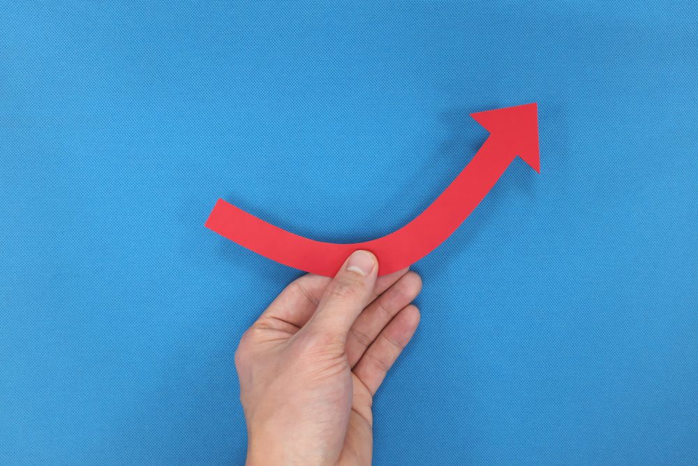
J Curve alludes to J-shaped diagrams that represent a curve that initially falls, then steeply rises above the starting point. The diagram obtained its name from its close similarity with the shape of letter “J”.
J curved diagrams are frequently used to describe economic policies that project unfavorable results in the short-term, however, bring larger benefits in the long-run. One of the examples frequently used is the way that a country’s balance of trade initially worsens following a devaluation of its currency, then quickly recovers and finally surpasses its previous performance.
In this situation the X-axis represents the time and the Y-axis represents the trade surplus.At first, as the currency loses its value, imported goods become more expensive therefore the surplus drops, however, after some time, as domestic goods compare cheaper with foreign goods, their export volume increases, thus boosting the trade surplus.
J curves are used to describe a wide range of fields and industries – starting from economic policies, to describing the returns of private equity funds, scenarios in economics, medicine, and political science, among others.


